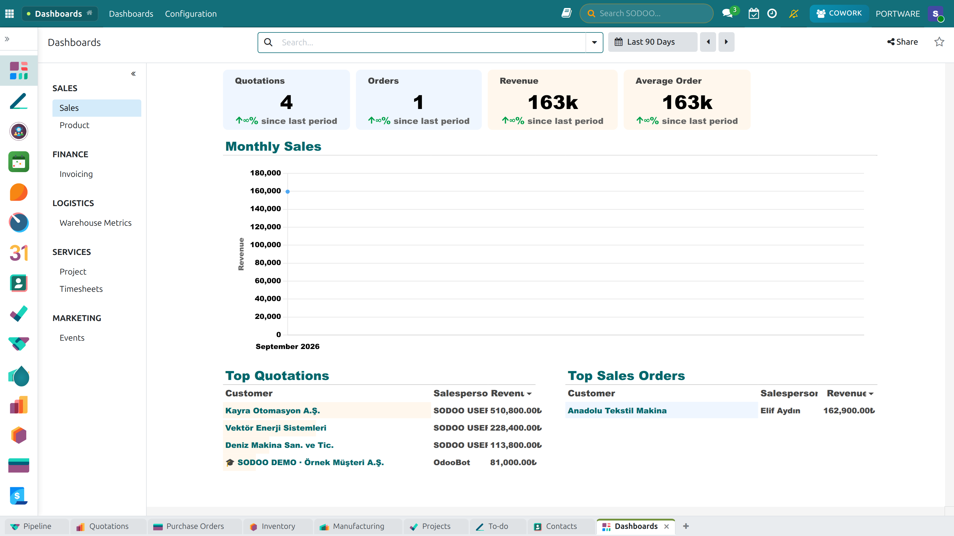
Dashboard Suite
The Dashboard Suite brings business intelligence directly into SODOO. Instead of navigating between multiple modules and running individual reports, each dashboard aggregates key metrics…
- A dashboard for every departmentReady dashboards for CRM, inventory, accounting and HR.
- Dashboards without codeAdd your own indicators by drag and drop.
- Live dataDashboards read the records; nothing is copied for a report.
Overview
The Dashboard Suite brings business intelligence directly into SODOO. Instead of navigating between multiple modules and running individual reports, each dashboard aggregates key metrics from across the system — financial data, sales pipeline, stock levels, and team activity — all on a single, visually rich screen.
All dashboards refresh in real time and are role-aware: what each user sees depends on their access rights and the data relevant to their department.
Tip: Each dashboard is accessible directly from the SODOO application menu.
No additional configuration is needed after installation — dashboards automatically
connect to the corresponding modules that are already installed.
Dynamic Dashboard
Fully customizable — drag, drop, and resize any widget
Accounting Dashboard
Revenue, expenses, cash flow, and overdue invoices
CRM Dashboard
Pipeline metrics, conversion rates, and sales targets
Inventory Dashboard
Stock levels, turnover rates, and reorder alerts
Activity Dashboard
Team activity, overdue tasks, and meeting schedules
Project Dashboard
Project progress, task completion, and resource utilization
🖼️
SODOO Dashboard, Main ViewThis screenshot is being refreshed. The previous image came from a live system and carried real people and customer data, so it was withdrawn; a replacement from the PORTWARE demo company is on its way.
SODOO Dashboard — main view
🖼️
SODOO Dashboard, Dark ThemeThis screenshot is being refreshed. The previous image came from a live system and carried real people and customer data, so it was withdrawn; a replacement from the PORTWARE demo company is on its way.
SODOO Dashboard — dark theme
🖼️
Dashboard Apps (2)This screenshot is being refreshed. The previous image came from a live system and carried real people and customer data, so it was withdrawn; a replacement from the PORTWARE demo company is on its way.
🖼️
Dashboard Apps (3)This screenshot is being refreshed. The previous image came from a live system and carried real people and customer data, so it was withdrawn; a replacement from the PORTWARE demo company is on its way.
🖼️
Dashboard Apps (4)This screenshot is being refreshed. The previous image came from a live system and carried real people and customer data, so it was withdrawn; a replacement from the PORTWARE demo company is on its way.
🖼️
Dashboard Apps (5)This screenshot is being refreshed. The previous image came from a live system and carried real people and customer data, so it was withdrawn; a replacement from the PORTWARE demo company is on its way.
🖼️
Sidebar View 1This screenshot is being refreshed. The previous image came from a live system and carried real people and customer data, so it was withdrawn; a replacement from the PORTWARE demo company is on its way.
🖼️
Sidebar View 2This screenshot is being refreshed. The previous image came from a live system and carried real people and customer data, so it was withdrawn; a replacement from the PORTWARE demo company is on its way.
🖼️
Sidebar View 3This screenshot is being refreshed. The previous image came from a live system and carried real people and customer data, so it was withdrawn; a replacement from the PORTWARE demo company is on its way.
🖼️
Sidebar View 4This screenshot is being refreshed. The previous image came from a live system and carried real people and customer data, so it was withdrawn; a replacement from the PORTWARE demo company is on its way.
Dynamic Dashboard
The odoo_dynamic_dashboard module provides a fully customizable dashboard builder. Users can assemble their own dashboard by choosing from a library of pre-built widgets and arranging them freely on a grid layout.
Dashboard Preview
Widget Types
| Widget Type |
Description |
Best Used For |
| KPI Tile |
Single metric with trend indicator |
Revenue, customer count, open orders |
| Bar Chart |
Comparative data across categories |
Sales by region, product by revenue |
| Line Chart |
Trends over time |
Monthly revenue, invoice count |
| Pie / Donut |
Proportional distribution |
Lead sources, product mix |
| Data Table |
Tabular list of records |
Overdue invoices, pending approvals |
| Activity Feed |
Live stream of recent activities |
CRM activities, chatter events |
Customization Steps
1
Open Dashboard
Click the app icon
→
2
Edit Mode
Click "Customize"
→
3
Add Widget
Choose from library
→
4
Configure
Set data source & filters
→
5
Save Layout
Layout persists per user
🖼️
Dynamic Dashboard ExampleThis screenshot is being refreshed. The previous image came from a live system and carried real people and customer data, so it was withdrawn; a replacement from the PORTWARE demo company is on its way.
Dynamic Dashboard — a project overview example
🖼️
The Add Widget menuThis screenshot is being refreshed. The previous image came from a live system and carried real people and customer data, so it was withdrawn; a replacement from the PORTWARE demo company is on its way.
Dashboard, Add Widget menu
🖼️
Doughnut Chart ExampleThis screenshot is being refreshed. The previous image came from a live system and carried real people and customer data, so it was withdrawn; a replacement from the PORTWARE demo company is on its way.
Doughnut Chart — dark theme
🖼️
Doughnut Chart VariantThis screenshot is being refreshed. The previous image came from a live system and carried real people and customer data, so it was withdrawn; a replacement from the PORTWARE demo company is on its way.
Doughnut Chart — alternative view
Accounting Dashboard
The odoo_accounting_dashboard module provides a dedicated financial overview for accounting managers and finance teams. It pulls live data from the Accounting module to display key financial KPIs without running individual reports.
Key Metrics Displayed
Revenue vs. Expenses
Monthly and year-to-date comparison of income and expenditure with trend line
Invoice Aging
Breakdown of overdue receivables by age bucket (0-30, 31-60, 61-90, 90+ days)
Cash Flow
Current bank balances and projected cash position for the next 30 days
Profit Margin
Gross and net profit margins for the current period vs. prior period
Overdue Invoices
Count and total amount of customer invoices past their due date
Bills to Pay
Upcoming vendor bills due in the next 7 and 30 days
Access Control: The Accounting Dashboard is visible only to users with
at least Accountant-level access in the Accounting module. Financial data is always
filtered by the user's company context.
🖼️
Accounting DashboardThis screenshot is being refreshed. The previous image came from a live system and carried real people and customer data, so it was withdrawn; a replacement from the PORTWARE demo company is on its way.
Accounting Dashboard — revenue, cost and cash-flow analysis
Invoicing Dashboard — overview
Main Invoicing Dashboard
CRM Dashboard
The crm_dashboard module gives sales managers a complete view of the sales pipeline, team performance, and revenue forecasts — all in one place.
Pipeline Metrics
Total weighted pipeline value broken down by stage. Shows expected revenue and close probability for each stage.
Stage Breakdown
Weighted Value
Win rate, average deal size, and time to close for the current period. Compare against previous period targets.
Win Rate
Avg. Deal Size
Revenue generated per salesperson this month vs. quota. Visual ranking with progress bars against individual targets.
Quota vs Actual
Ranking
Which lead sources (website, email campaign, cold call, referral) generate the most revenue. Helps prioritize marketing spend.
Lead Sources
Attribution
Sales Team Filtering: The CRM Dashboard automatically scopes data
to the sales teams the current user belongs to. Sales managers can toggle between
their own team view and an all-teams view using the filter bar at the top.
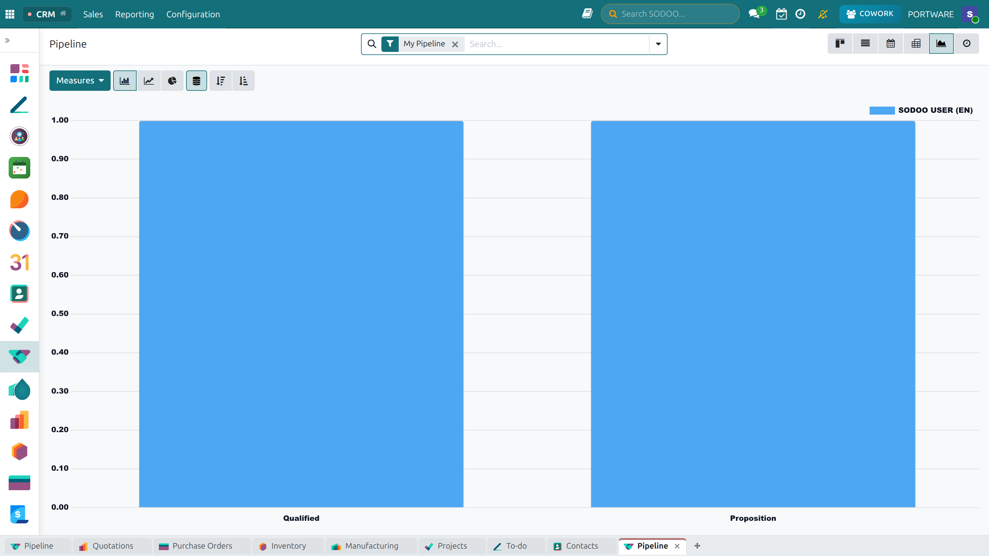
CRM Dashboard — sales funnel and opportunity analysis
Inventory Dashboard
The inventory_stock_dashboard_odoo module consolidates warehouse and stock data into a single operational view for warehouse managers and logistics teams.
Inventory KPIs
| Metric |
Description |
Alert Condition |
| Stock On Hand |
Current quantity in all warehouses |
Below minimum stock level |
| Stock Valuation |
Total inventory value at cost price |
Significant change vs. prior period |
| Inventory Turnover |
How many times stock is sold per year |
Below industry benchmark |
| Pending Deliveries |
Sales orders waiting for shipment |
More than 24 hours overdue |
| Reorder Alerts |
Products below their reorder point |
Any product below reorder rule |
| Incoming Shipments |
Purchase orders in transit |
Overdue from supplier |
ABC Analysis Widget
The Inventory Dashboard includes an ABC analysis widget that automatically categorizes products by revenue contribution:
- Class A: Top 20% of products generating 80% of revenue — high priority
- Class B: Next 30% of products generating 15% of revenue — medium priority
- Class C: Remaining 50% of products generating 5% of revenue — low priority
Multi-Warehouse Support: The Inventory Dashboard aggregates data across all warehouses by default.
Use the warehouse filter to view data for a specific location. This filter also affects all widget calculations on the dashboard.
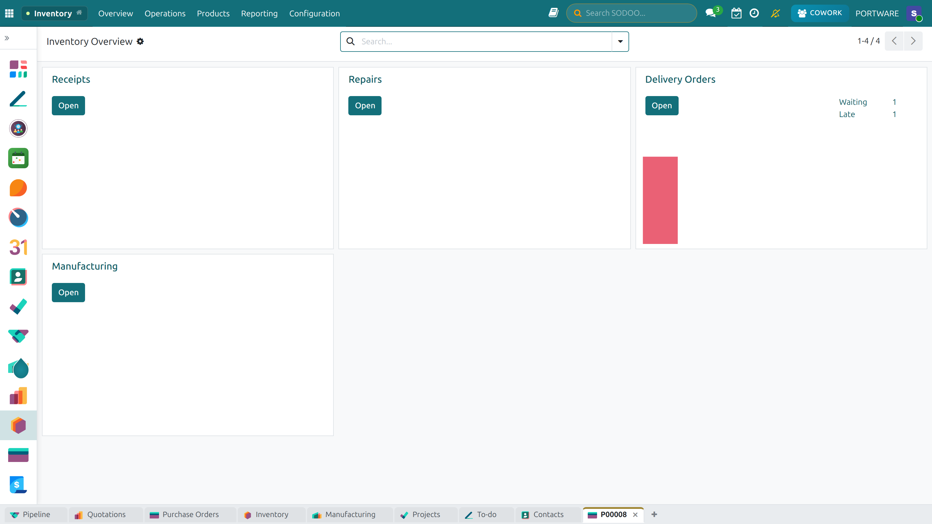
Stock Dashboard — warehouse and stock operations analysis
Activity Dashboard
The Activity Dashboard provides managers with a bird's-eye view of what their team is doing — scheduled calls, meetings, emails, and follow-ups — so that nothing falls through the cracks.
Activity Metrics
Overdue Activities
Activities past their deadline, grouped by user and activity type
Today's Activities
All activities due today, with quick navigation to the relevant record
Call Summary
Calls completed vs. planned for the current week
Email Activity
Emails sent, received, and awaiting response
Project Dashboard
The Project Dashboard gives project managers a consolidated view of all active projects, their timelines, budget consumption, and task completion rates.
Project Health Indicators
Task Completion Rate
% of tasks completed vs. total planned for each project
Time Tracking
Hours logged vs. estimated for current sprint
Resource Utilization
Team member workload and allocation percentages
Blocked Tasks
Tasks with dependencies that are waiting for other tasks
Deadline Risk
Projects at risk of missing their deadline based on current velocity
Bug / Issue Backlog
Open issues by severity and project
Installation
Module Dependencies
| Module |
Technical Name |
Required Odoo Modules |
| Dynamic Dashboard |
odoo_dynamic_dashboard |
base, web |
| Accounting Dashboard |
odoo_accounting_dashboard |
account, account_accountant |
| CRM Dashboard |
crm_dashboard |
crm, sale_management |
| Inventory Dashboard |
inventory_stock_dashboard_odoo |
stock, purchase |
| Activity Dashboard |
activity_dashboard_mngmnt |
mail, calendar |
| Project Dashboard |
project_dashboard_mngmnt |
project, hr_timesheet |
Installation Steps
1
Go to Apps
Main menu → Apps
→
2
Search
Type "dashboard"
→
3
Select Modules
Choose desired dashboards
→
→
5
Access
App appears in menu
Odoo 19 Compatibility: The Dashboard Suite included in SODOO has been
patched for Odoo 19.0. Specifically, OWL component imports have been updated from
legacy paths to the new @odoo/owl module system.
Creating Custom Dashboards
The Dynamic Dashboard module allows any user to build their own personalized dashboard. Layouts are saved per user, so different team members can have different views without affecting each other.
Custom Widget Configuration
When adding a widget to the Dynamic Dashboard, you configure:
| Setting |
Description |
| Widget Name |
Display label shown at the top of the widget |
| Data Source |
Odoo model to query (e.g., sale.order, account.move) |
| Measure Field |
The numeric field to aggregate (e.g., amount_total, qty_done) |
| Aggregation |
Sum, Count, Average, Min, or Max |
| Domain Filter |
Optional: restrict data (e.g., only confirmed orders) |
| Color Theme |
Widget background and accent color |
| Chart Type |
Tile, Bar, Line, Pie, or Table |
Best Practice: For executive-level dashboards, focus on 5–8 high-impact
KPI tiles at the top (revenue, orders, customer count) and use charts below for trends.
Too many widgets on one screen reduces readability — use separate dashboards for
different audiences (Operations, Finance, Sales).